Clustering on the World Happiness Report 2016
Overview
This notebook will run 4 main clustering models and 2 optional:
- K-means
- Agglomerative Clustering
- Affinity Propagation
- Gaussian Mixture
- DBSCAN (optional)
- HDBSCAN (optional)
on the 2016 World Happiness Report dataset.
Each model will be visualized in 3 different forms:
- A scatter plot using unaltered data
- A scatter plot using scaled data
- A Boxplot of the unaltered data
Imports
library(tidyverse)## Registered S3 methods overwritten by 'ggplot2':
## method from
## [.quosures rlang
## c.quosures rlang
## print.quosures rlang## Registered S3 method overwritten by 'rvest':
## method from
## read_xml.response xml2## -- Attaching packages -------------------------------------------------------------------------------------------------------- tidyverse 1.2.1 --## v ggplot2 3.1.1 v purrr 0.3.2
## v tibble 2.1.1 v dplyr 0.8.0.1
## v tidyr 0.8.3 v stringr 1.4.0
## v readr 1.3.1 v forcats 0.4.0## -- Conflicts ----------------------------------------------------------------------------------------------------------- tidyverse_conflicts() --
## x dplyr::filter() masks stats::filter()
## x dplyr::lag() masks stats::lag()library(magrittr) # More pipe opperators##
## Attaching package: 'magrittr'## The following object is masked from 'package:purrr':
##
## set_names## The following object is masked from 'package:tidyr':
##
## extractlibrary(reshape2)##
## Attaching package: 'reshape2'## The following object is masked from 'package:tidyr':
##
## smithslibrary(corrplot)## corrplot 0.84 loaded#library(cluster)
library(apcluster) # Affinity Propagation##
## Attaching package: 'apcluster'## The following object is masked from 'package:stats':
##
## heatmaplibrary(factoextra) # Cluster visualization## Welcome! Related Books: `Practical Guide To Cluster Analysis in R` at https://goo.gl/13EFCZlibrary(ape) # dendrogram plotting
library(ClusterR) # Gaussian Mixtures## Loading required package: gtoolslibrary(dbscan) # DBSCAN, HDBSCANData
The 2016 World Happiness Report dataset may be obtained from
https://www.kaggle.com/unsdsn/world-happiness
The dataset models countries across the world using the fictitious country of ‘Dystopia’ as a baseline. Dystopia is the amalgam of the worst scores across the world combined to create a country worse than every other in all categories. So, in essence, this data is modeled in such a way as to measure how much better off is a country than the worst it could possibly be.
It has 13 variables, of which that last 7 are calculated via some weighting metric:
Country- Name of the country.Region- Region the country belongs to.Happiness Rank- Rank of the country based on the Happiness Score.Happiness Score- Metric measured in 2016 by asking sampled people: “How would you rate your happiness on a scale of 0 to 10 where 10 is the happiest.”Lower Confidence Interval- Lower Confidence Interval of the Happiness Score.Upper Confidence Interval- Upper Confidence Interval of the Happiness Score.Economy (GDP per Capita)- The extent to which GDP contributes to the calculation of the Happiness Score.Family- The extent to which Family contributes to the calculation of the Happiness Score.Health (Life Expectancy)- The extent to which Life expectancy contributed to the calculation of the Happiness Score.Freedom- The extent to which Freedom contributed to the calculation of the Happiness Score.Trust (Government Corruption)- The extent to which Perception of Corruption contributes to Happiness Score.Generosity- The extent to which Generosity contributed to the calculation of the Happiness Score.Dystopia Residual- The extent to which Dystopia Residual contributed to the calculation of the Happiness Score.
Relevant files: data/ - contains happiness_2016.csv the externally obtained data for this analysis. And Lab9_R_edo.Rmd
(whr <- read.csv('data/happiness_2016.csv'))Exploratory Data Analysis
The dataset contains NA values, however there are a few examples where a field’s contribution to happiness is 0.0. This is likely a side effect of having a modeled rather than purely gathered dataset. One possibility is that if a country ranked the lowest for that particular characteristic it was simply zeroed out.
Happiness_Score is the summation of Economy_GDP_per_Capita, Family, Health_Life_Expectancy, Freedom, Trust_Government_Corruption, Generosity, and Dystopia_Residual within a margin of error between the confidence intervals.
Other than Country, Region, and Happiness Rank, all of the variables are continuous floating point.
whrx <- select(whr, -c(Happiness.Rank,Lower.Confidence.Interval,Upper.Confidence.Interval ))Here we removed Happieness Rank, and the Confidence Intervals because these are just noise in the data w.r.t the modeling we will be doing. Rank could easily be added back in through a simple sort enumeration, and the CIs do not really add a tremendous amount of additional information passed Happiness.Score.
colo<- colorRampPalette(c("blue", "white", "red"))(200)
corrplot::corrplot(cor(data.matrix(whrx)), col=colo, tl.col = "black")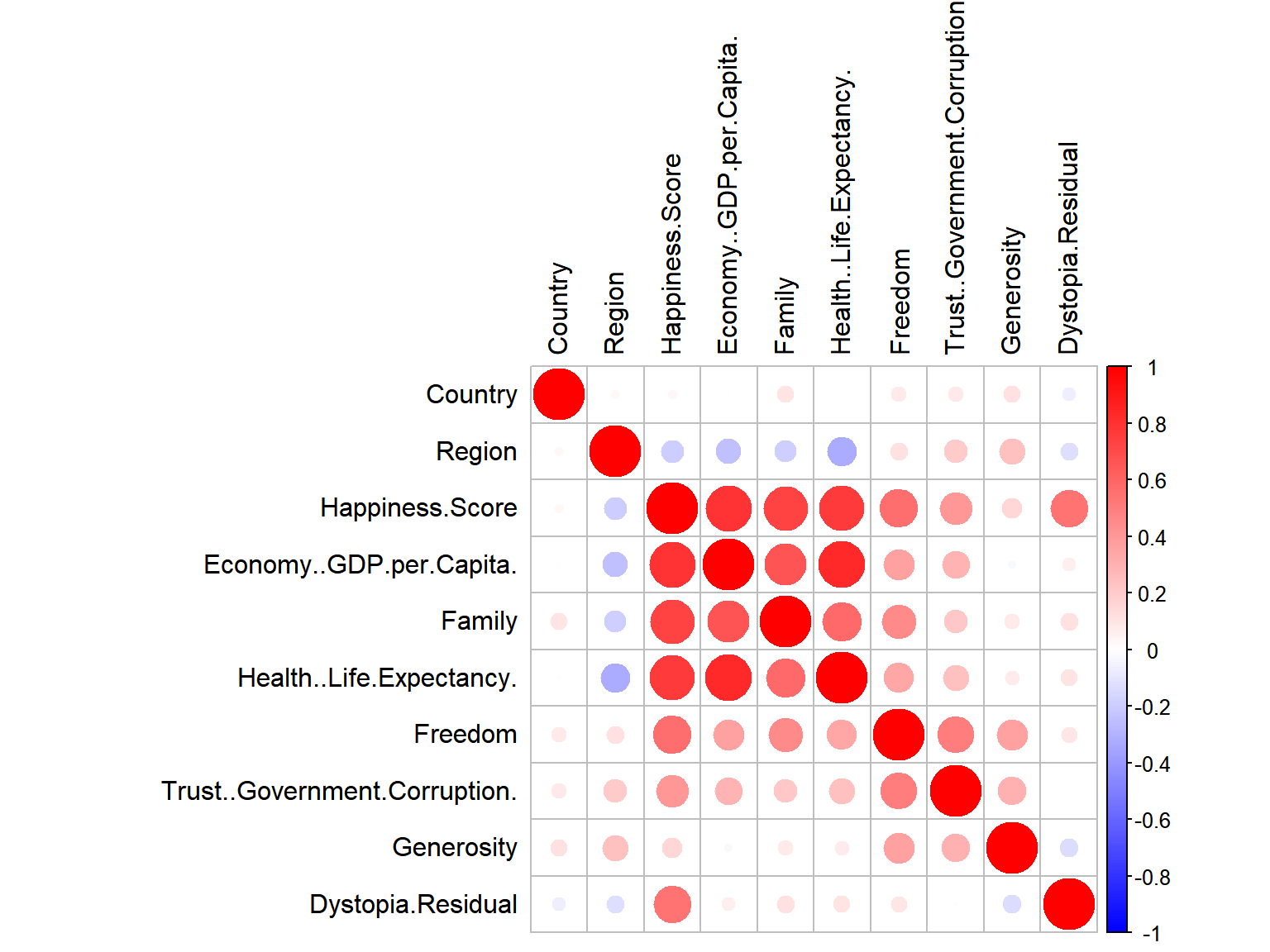
whrx.num <- data.matrix(select(whrx, -c(Country, Region)))
whrx.scale <- as.data.frame(scale(whrx.num))
Exclude Country and Region from the scaling process since they are non-numerics
row.names(whrx.scale) <- whrx$Country
colnames(whrx.scale)<-gsub('\\.$','',colnames(whrx.scale))
Set the row names to be each Country’s name so that they may be labeled during plotting. Strip out the end . because it’s odd to have
Models
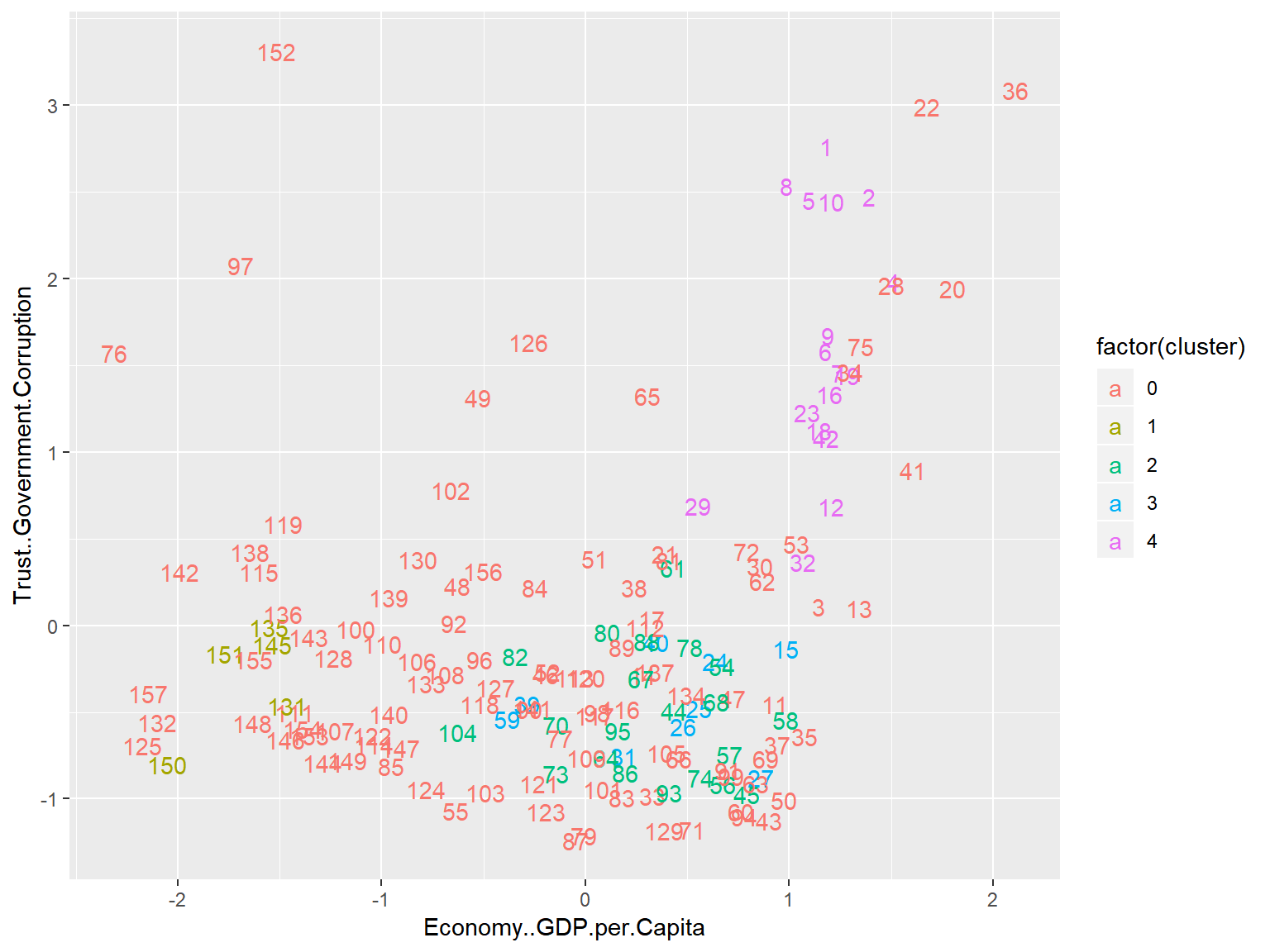
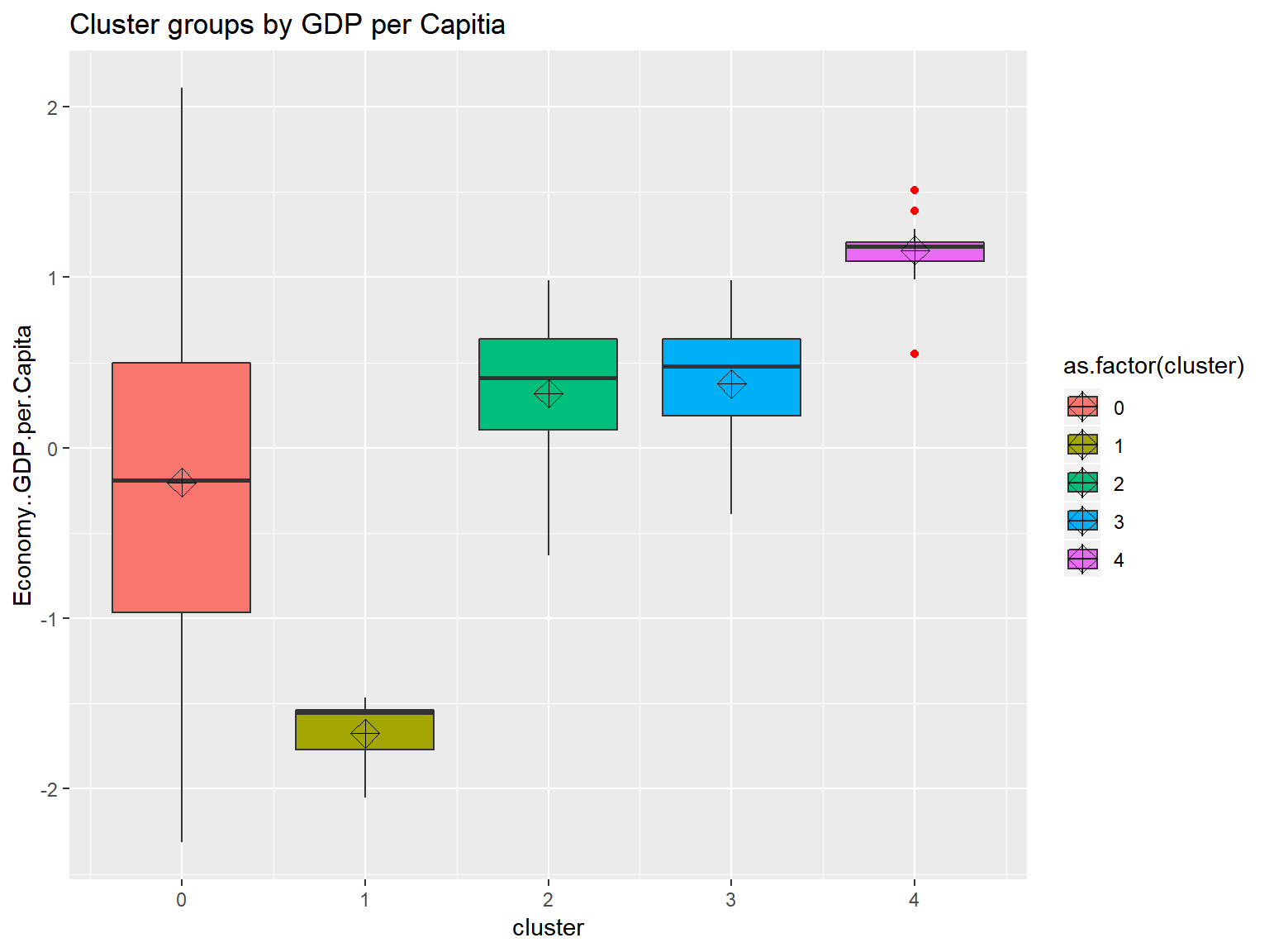
triplot <- function(orgin_data, cluster_data){
  p1 <- fviz_cluster(list(data = orgin_data, cluster = cluster_data), repel = TRUE)

  p2 <- orgin_data %>% as_tibble() %>%
  mutate(cluster=cluster_data, Country=row.names(.)) %>%
  ggplot(aes(x=Economy..GDP.per.Capita,
             y=Trust..Government.Corruption,
             color=factor(cluster),
             label=Country)) +
  geom_text()

  p3 <- orgin_data %>% as_tibble() %>%
  mutate(cluster=cluster_data) %>%
  ggplot(aes(x=cluster,
             y=Economy..GDP.per.Capita,
             fill=as.factor(cluster))) +
  geom_boxplot(outlier.colour="red", aes(group=cluster)) +
  stat_summary(fun.y=mean, geom="point", shape=9, size=4) +
  ggtitle("Cluster groups by GDP per Capitia")

  print(p1)
  print(p2)
  print(p3)

}
Cluster plotting helper function
K-Means Clustering
whrx.km <- kmeans(whrx.scale,3) # Limit to 3 cluster groupswhrx.dist <- get_dist(whrx.scale, method = "euclidean")
fviz_dist(whrx.dist, gradient = list(low = "#00AFBB", mid = "white", high = "#FC4E07"))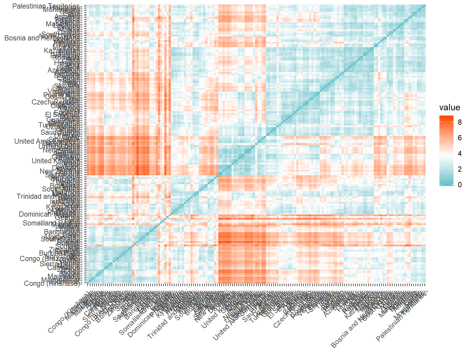 A plot showing the eudclidean distance between countries shows some fairly distinct groups forming
fviz_cluster(whrx.km, data = whrx.scale, repel = TRUE)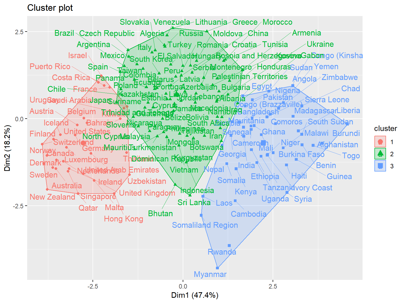 Cluster plot shows the best overall clustering through kmeans, but provides little by way of interpretability
(whrx.km.grps <- aggregate(whrx.scale,by=list(whrx.km$cluster),FUN=mean)) #(whrx.km.grps <- whrx.scale %>% group_by(whrx.km$cluster) %>% summarise_all(mean)) # Provides an equivalent resultwhrx.scale %>%
as_tibble() %>%
mutate(cluster=whrx.km$cluster, Country=row.names(.)) %>%
ggplot(aes(x=Economy..GDP.per.Capita,
y=Trust..Government.Corruption,
color=factor(cluster),
label=Country)) +
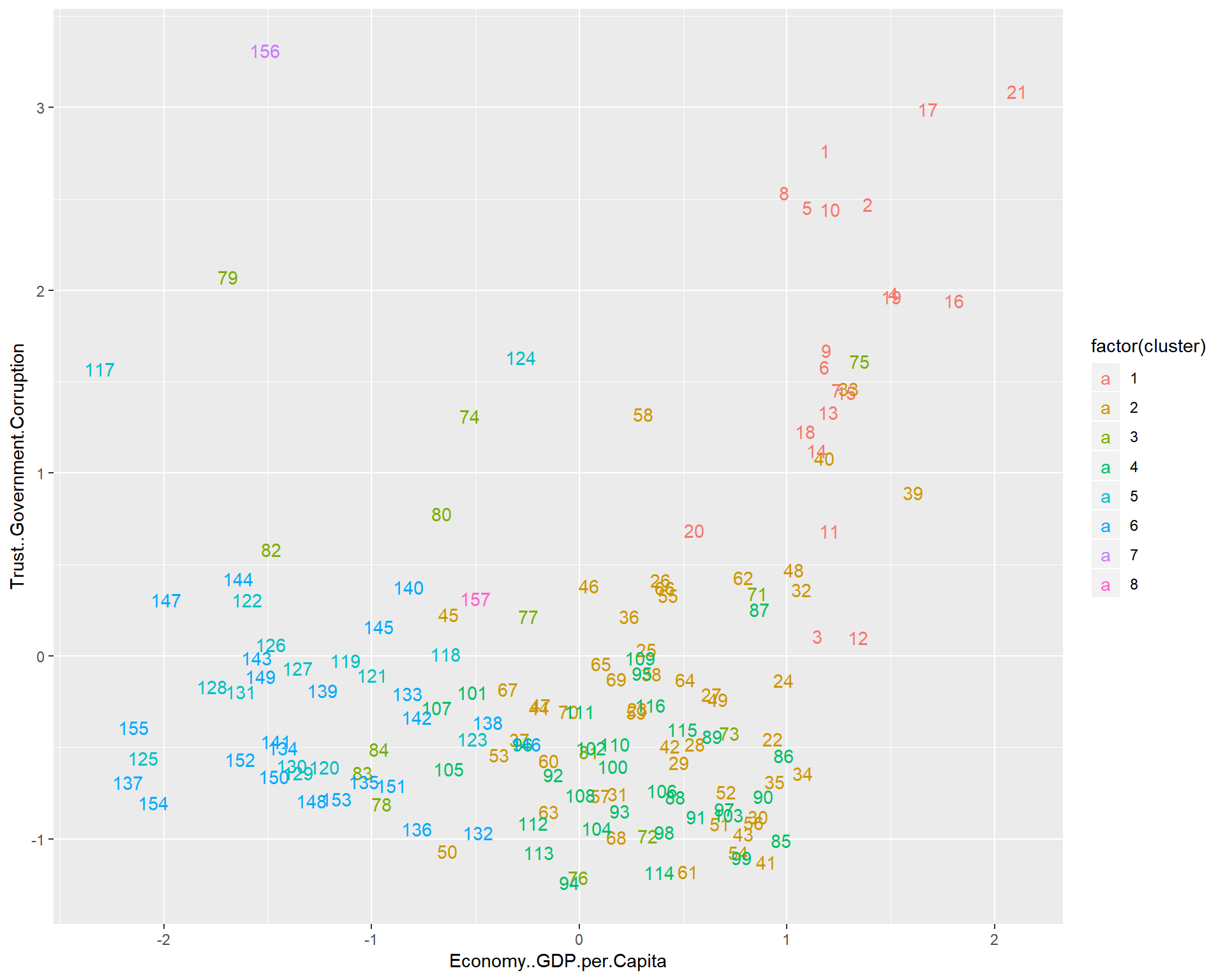
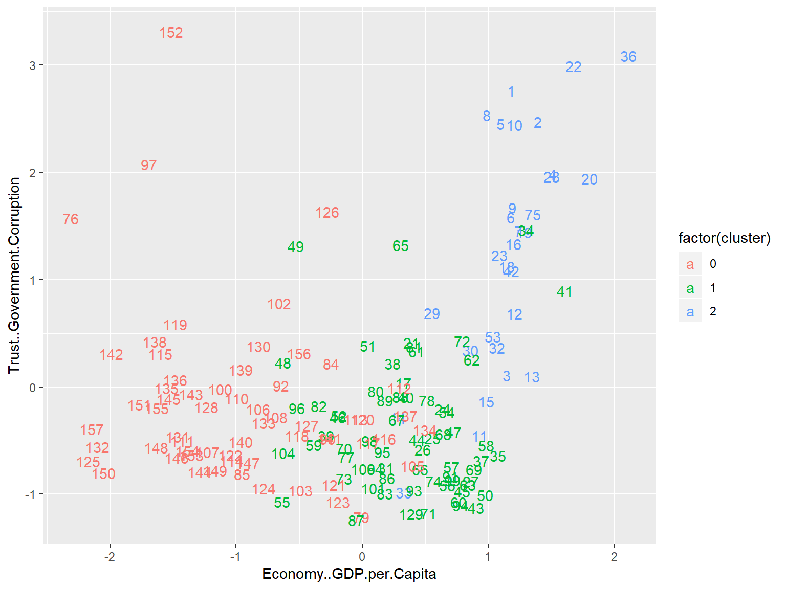
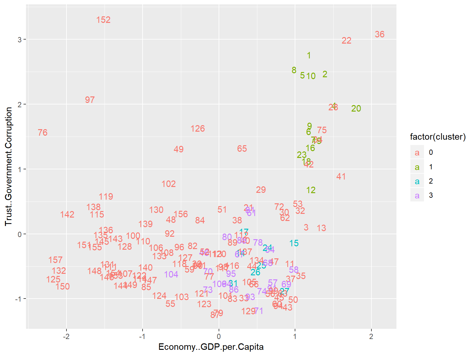
geom_text()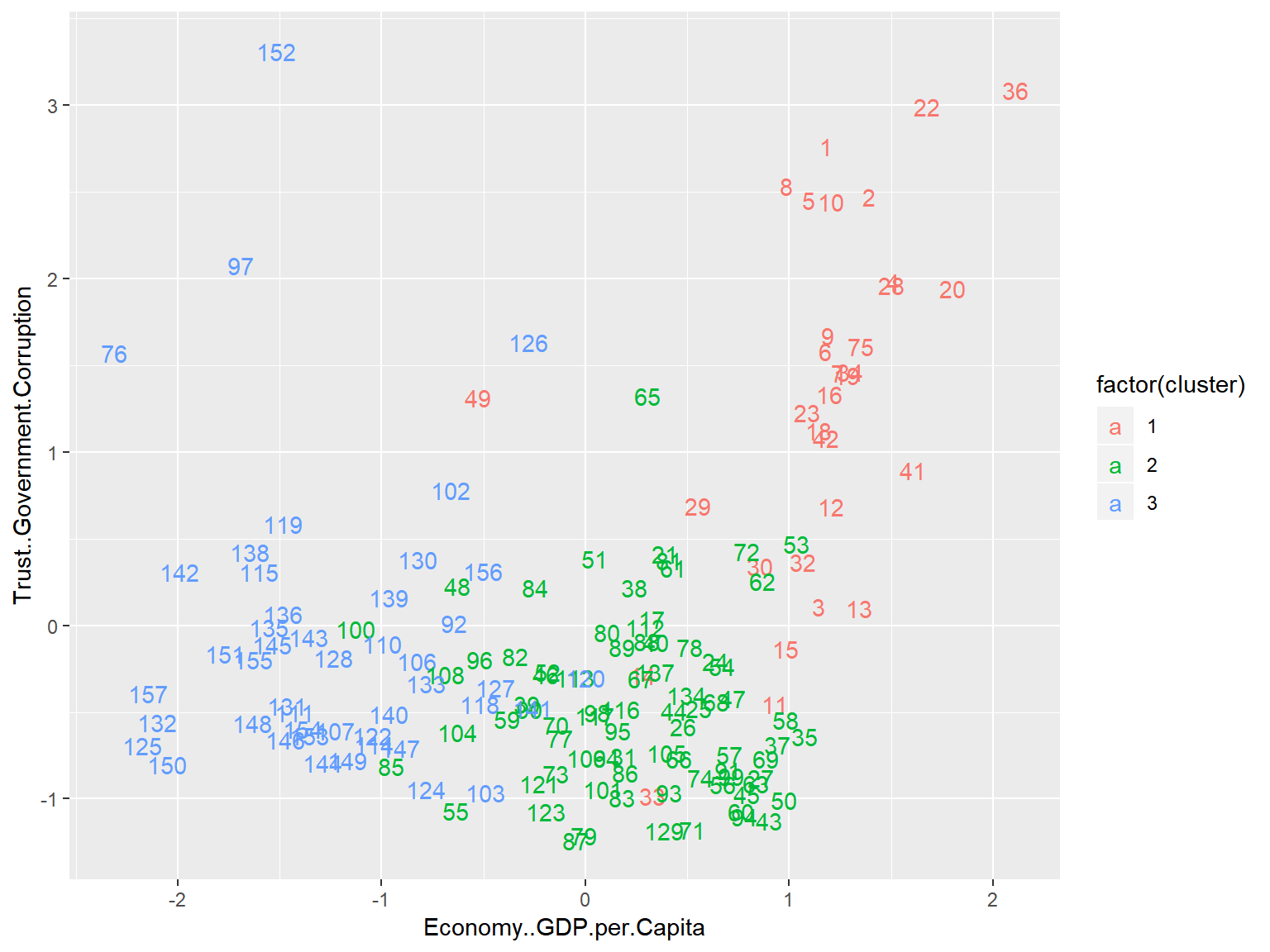 This plot lacks some of the bells and whistles of the previous plot, but now we are plotting against Corruption and GDP per Capita, allowing for a much greater degree of interpretability.
whrx.scale %>%
as_tibble() %>%
mutate(cluster=whrx.km$cluster) %>%
ggplot(aes(x=cluster,
y=Economy..GDP.per.Capita,
fill=as.factor(cluster))) +
geom_boxplot(notch=TRUE, outlier.colour="red", aes(group=cluster)) +
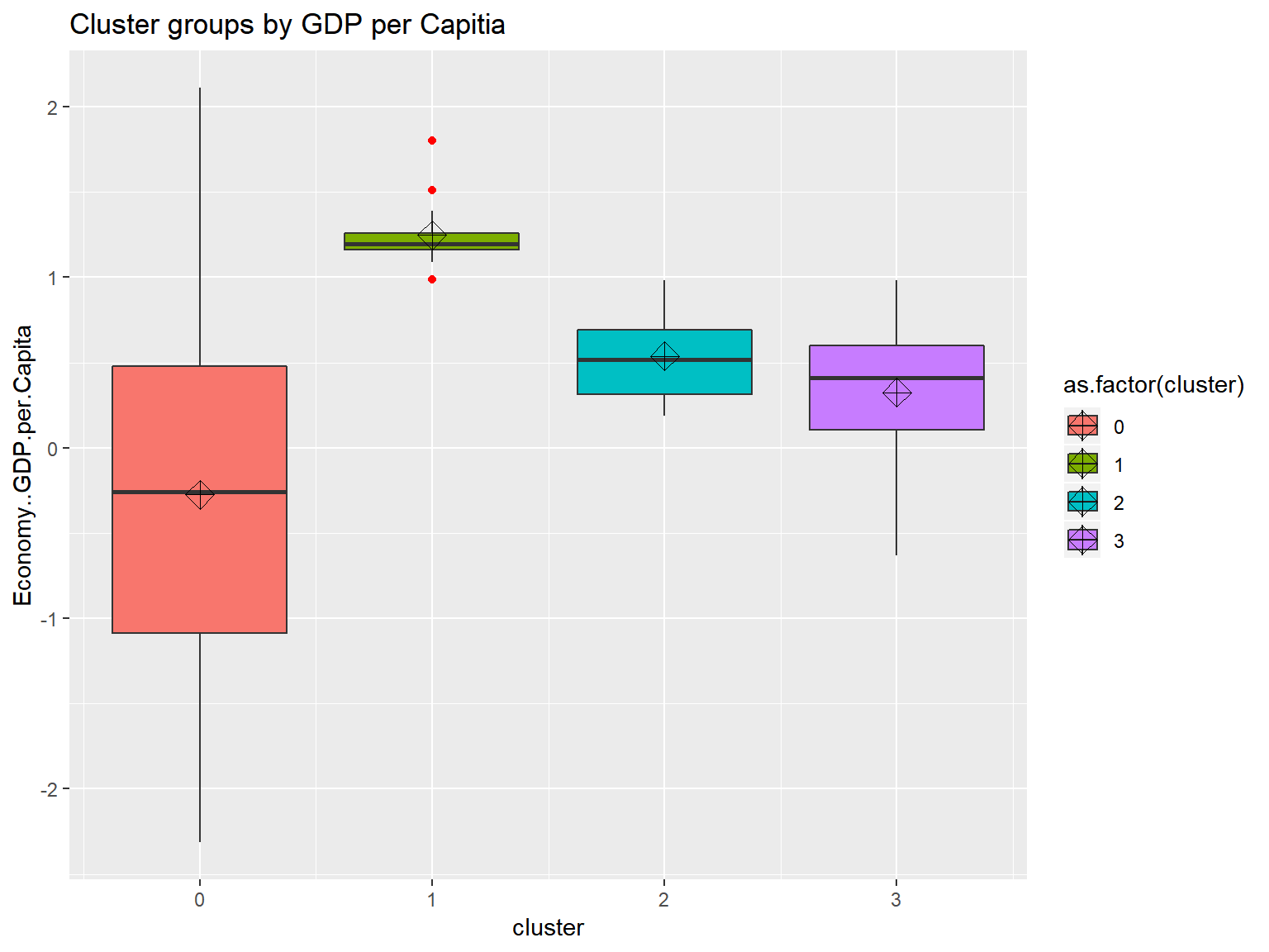
stat_summary(fun.y=mean, geom="point", shape=9, size=4) +
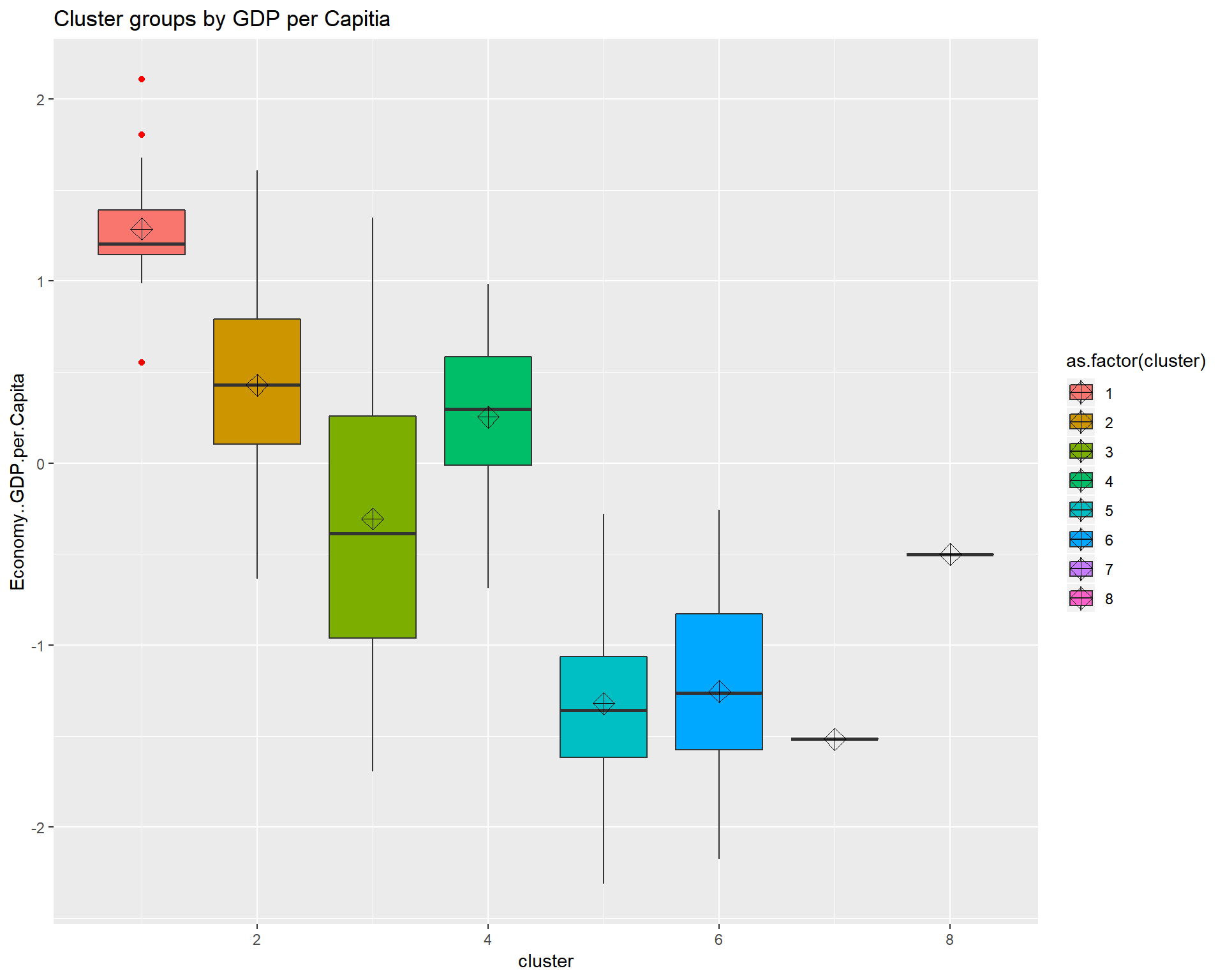
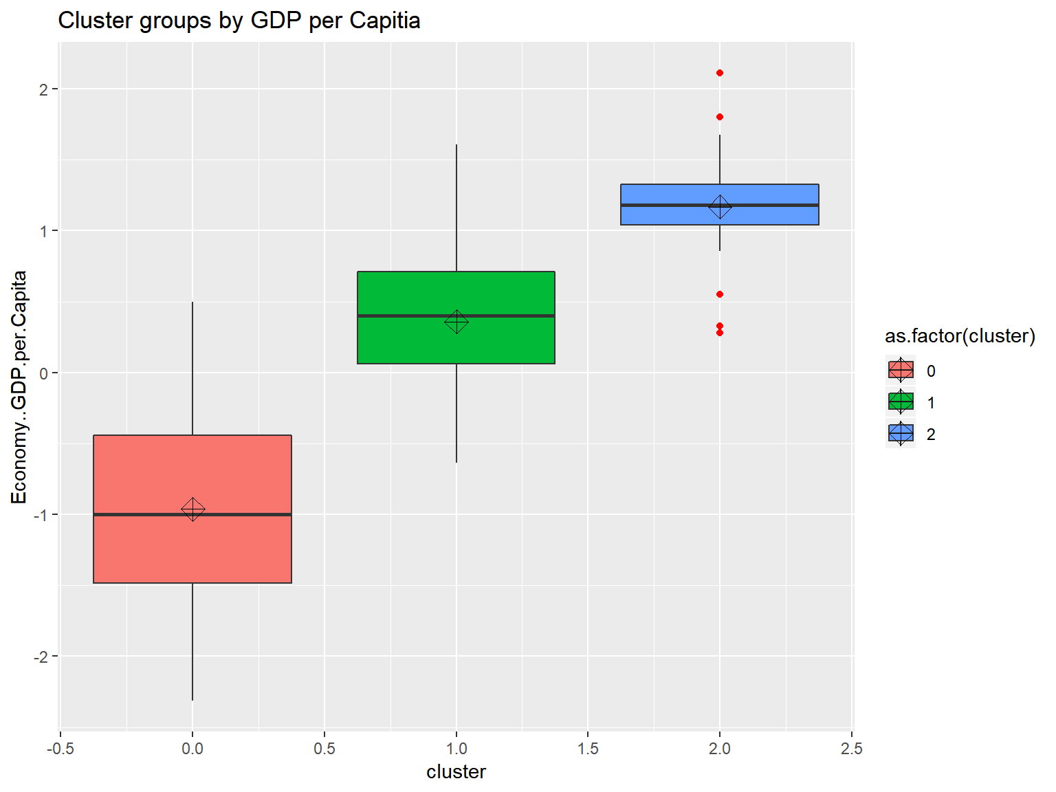
ggtitle("Cluster groups by GDP per Capitia")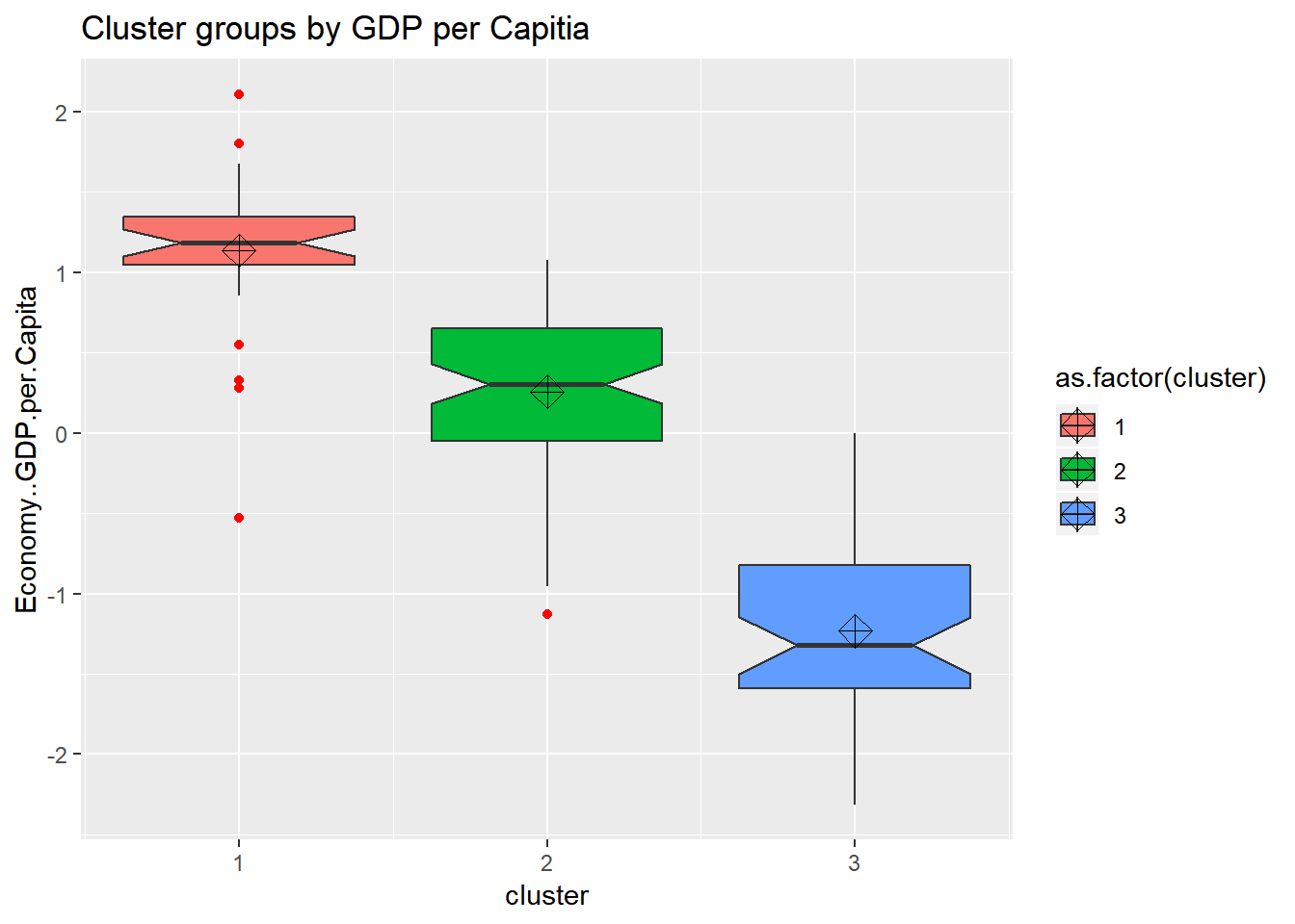 looking at the boxplots we see that cluster.1 has a fair amount of outliers and a small dispersion. It also shows that the clustering algorthim was at least somewhat successful given that if two boxes’ notches do not overlap there is ‘strong evidence’ (95% confidence) their medians differ. Citation - “Comparing Data Distributions.”
Agglomorative Clustering
# Ward Hierarchical Clustering
whrx.ac <- hclust(whrx.dist, method="ward.D2")
ctree <- cutree(whrx.ac, k=3)

# use ape package to make phylogram
plot(as.phylo(whrx.ac),
     type="fan",
     label.offset = 0.5,
     cex = 0.8,
tip.color = c("red3", "blue3", "green3")[ctree]) 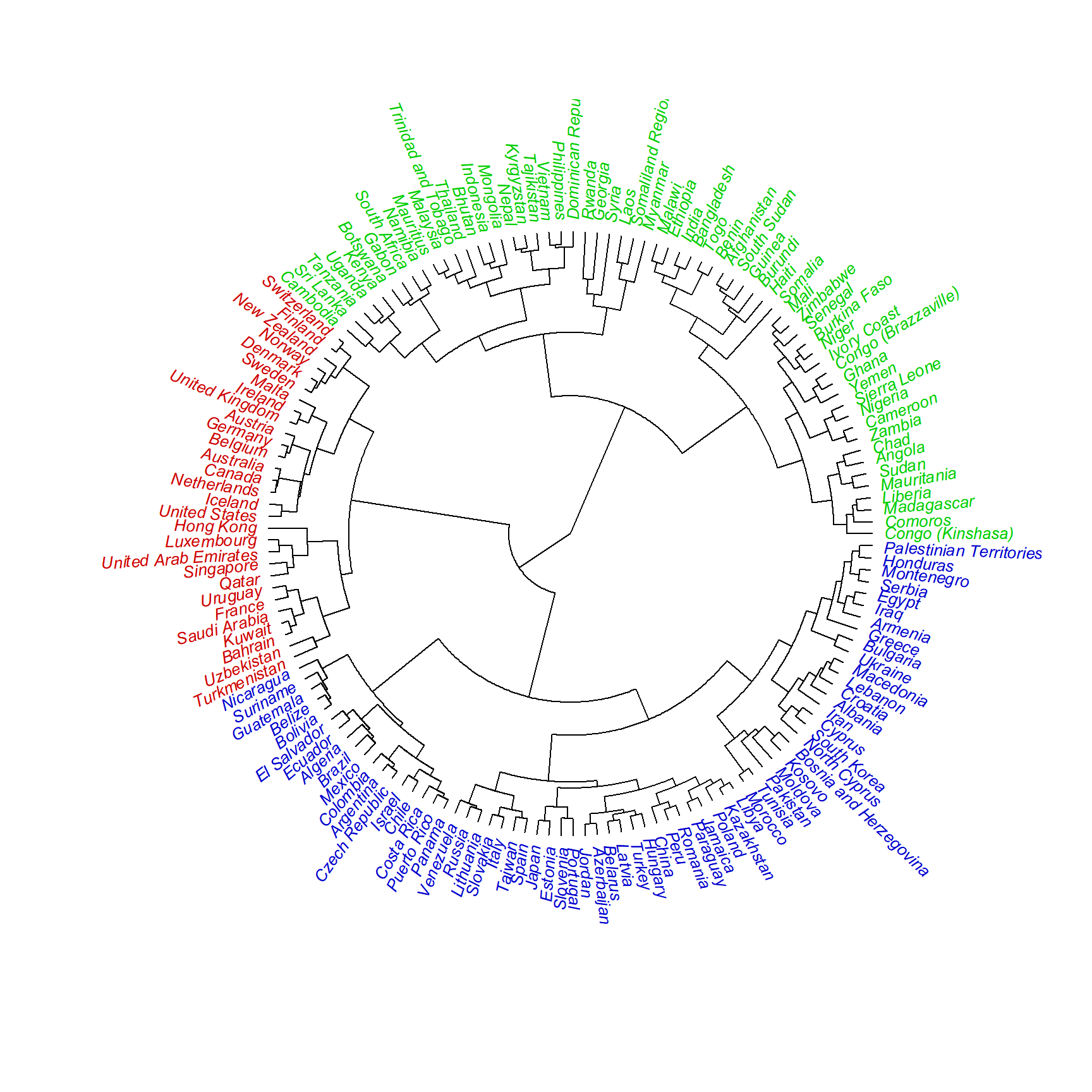
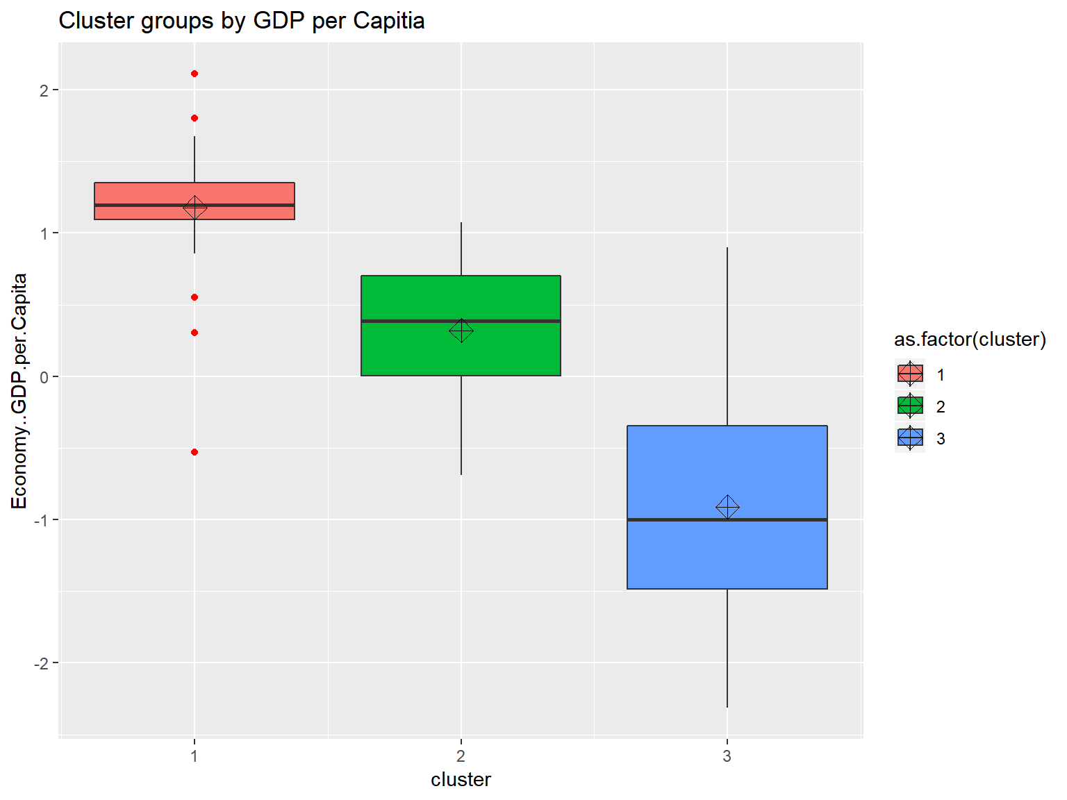
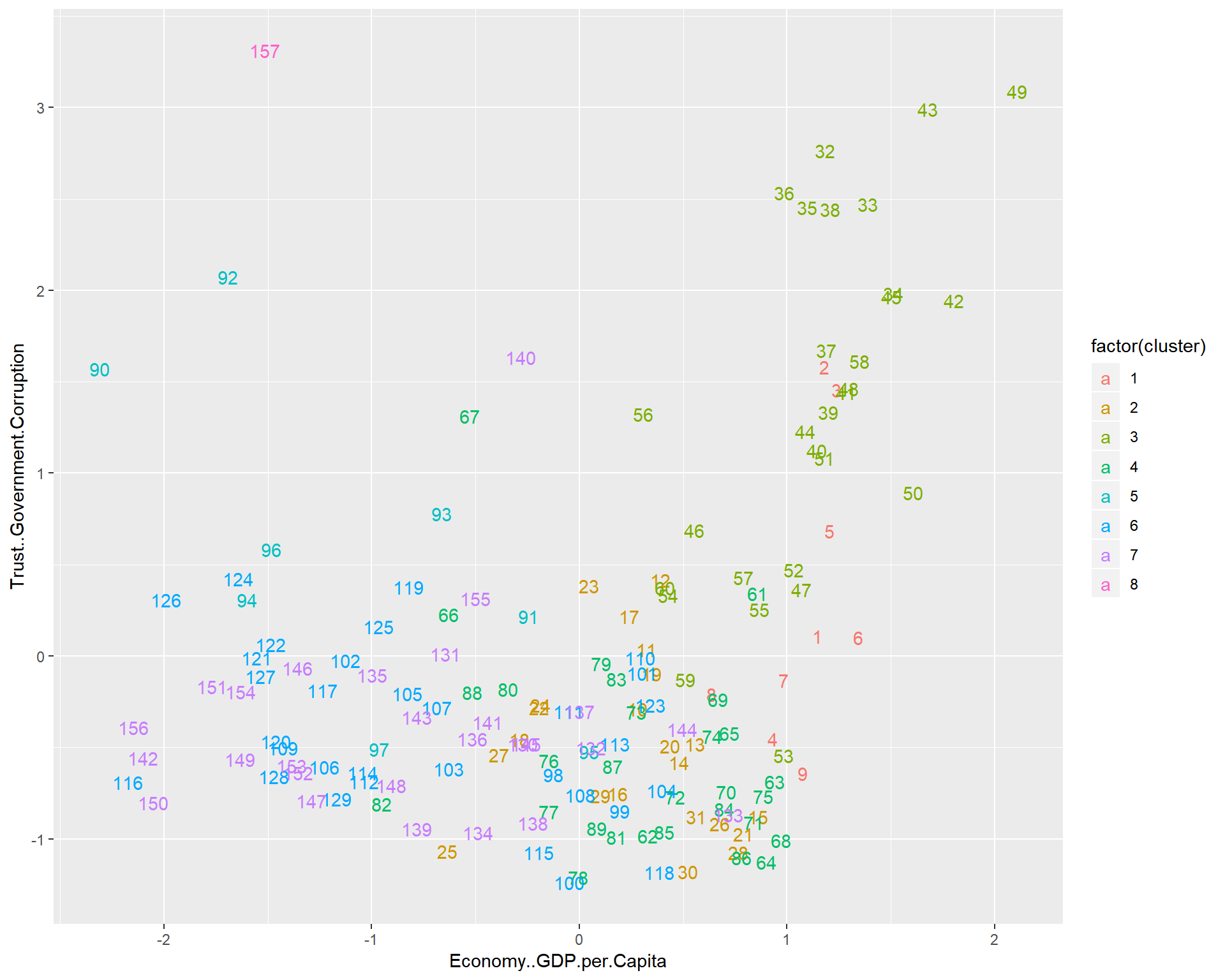
triplot(whrx.scale, ctree)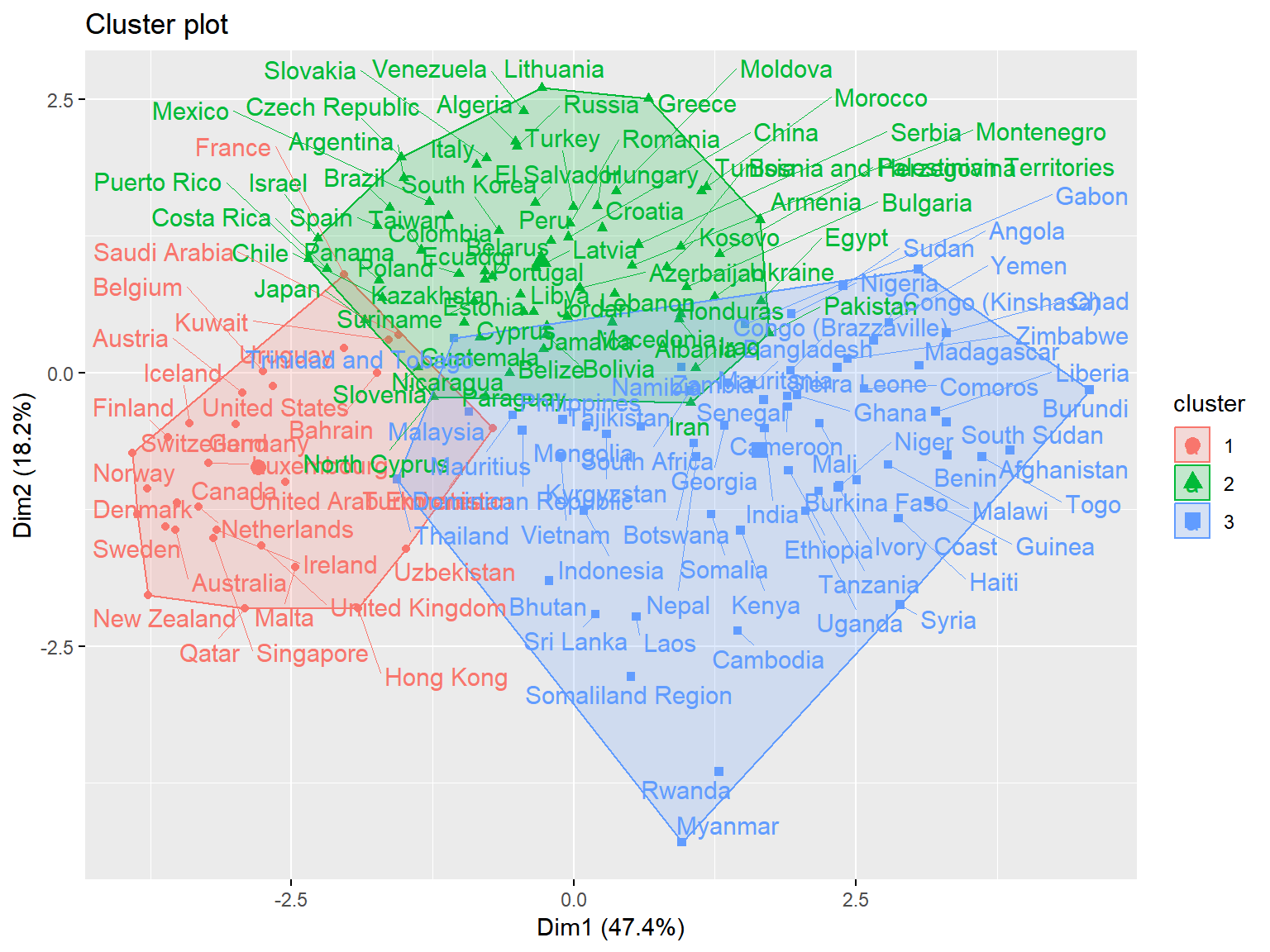

fviz_nbclust(whrx.scale, FUN = hcut, method = "wss") # elbow method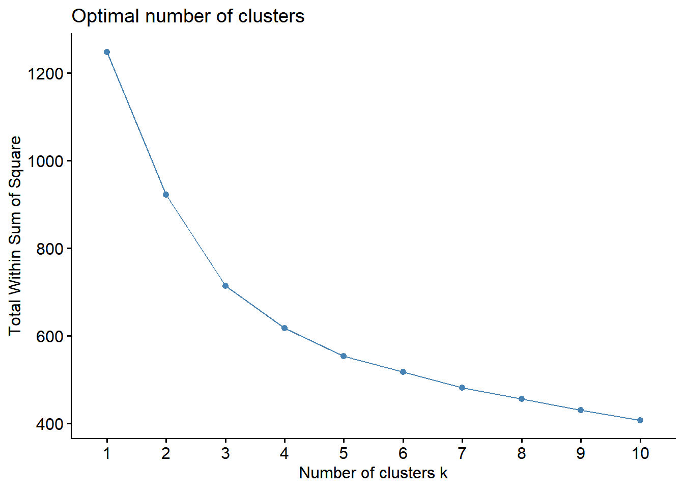
fviz_nbclust(whrx.scale, FUN = hcut, method = "silhouette") # average silhouette method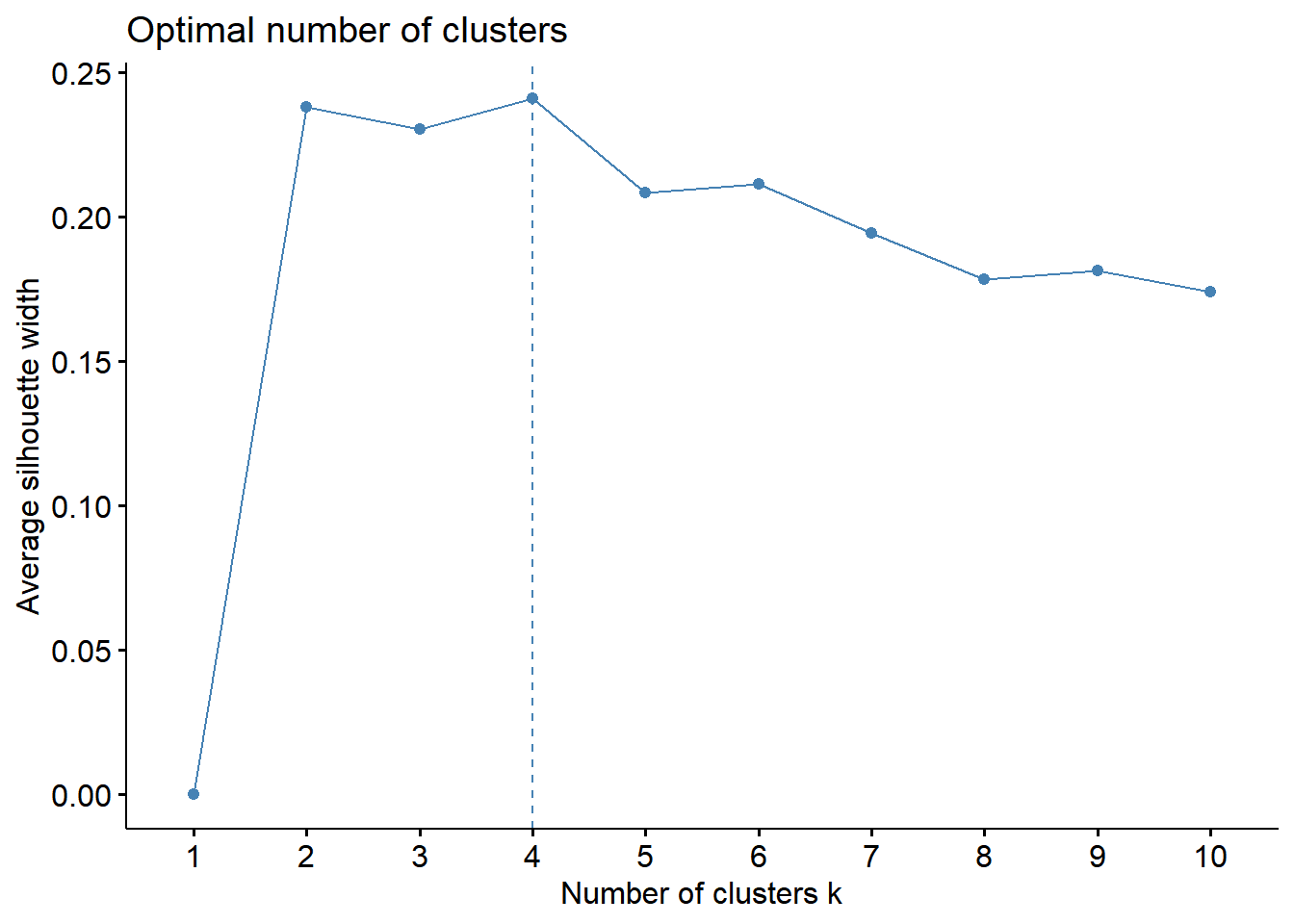 Elbow method - The total within-cluster sum of square (wss) measures the compactness of the clustering and we want it to be as small as possible. The optimal number of clusters appears as the bend in the “elbow”.
Silhoutte method - determines how well each object lies within its cluster. A high average silhouette width indicates a good clustering.
These plots indicate that 4 clusters seems to be the optimial number to best segment the data
library(NbClust)res <- NbClust(whrx.scale, distance = "euclidean",
min.nc=2, max.nc=6,
method = "ward.D2", index = "kl")
fviz_cluster(list(data = whrx.scale, cluster = res$Best.partition), repel = TRUE)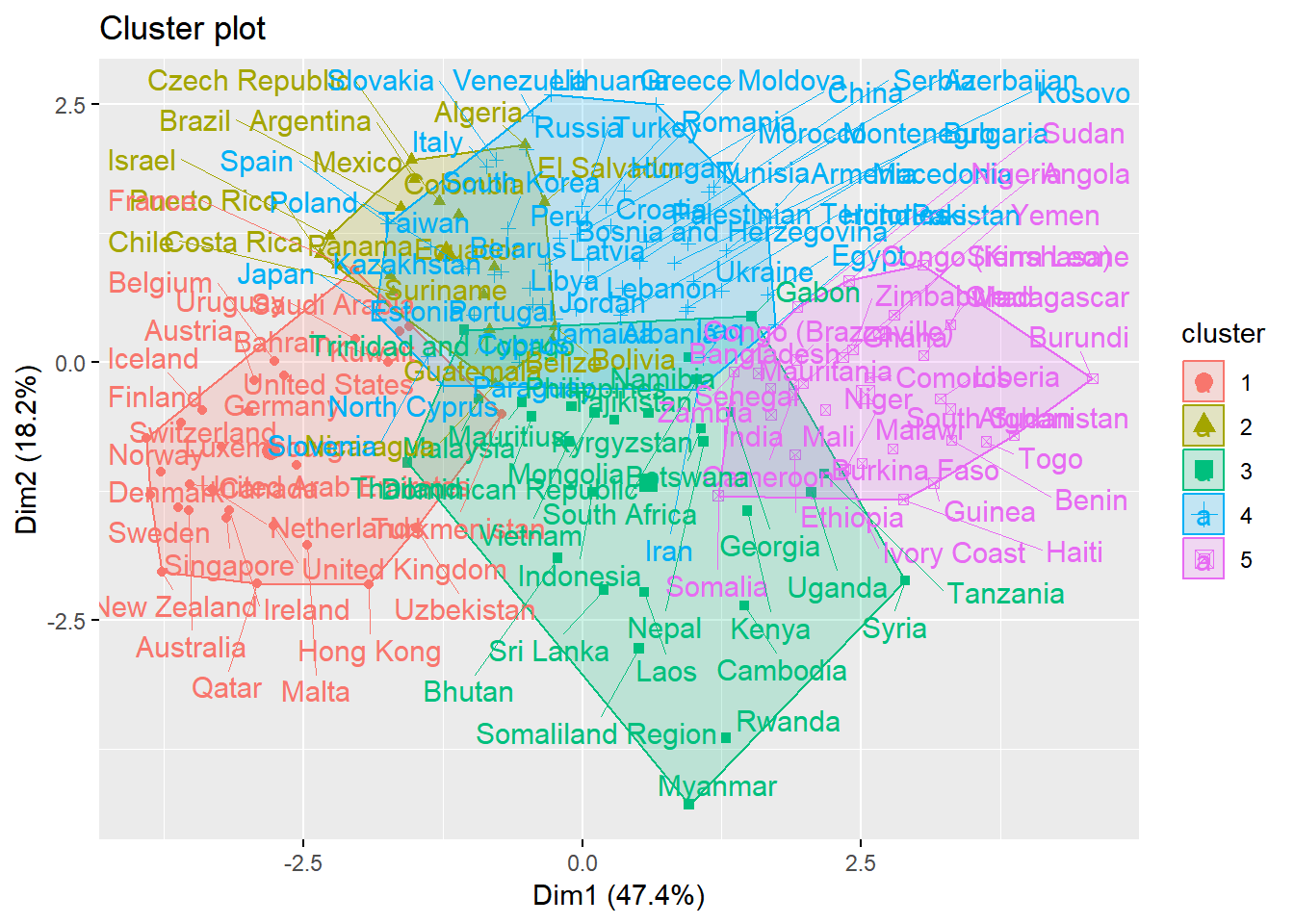
Affinity Propagation
whrx.ap <- apcluster(negDistMat(r=6),whrx.scale, details=TRUE)
whrx.apl <- apclusterL(s=negDistMat(r=2), x=whrx.scale, frac=0.05, sweeps=15)
#str(whrx.ap)
apmelt <- melt(whrx.ap@clusters)
triplot(whrx.scale[apmelt$value,], apmelt$L1)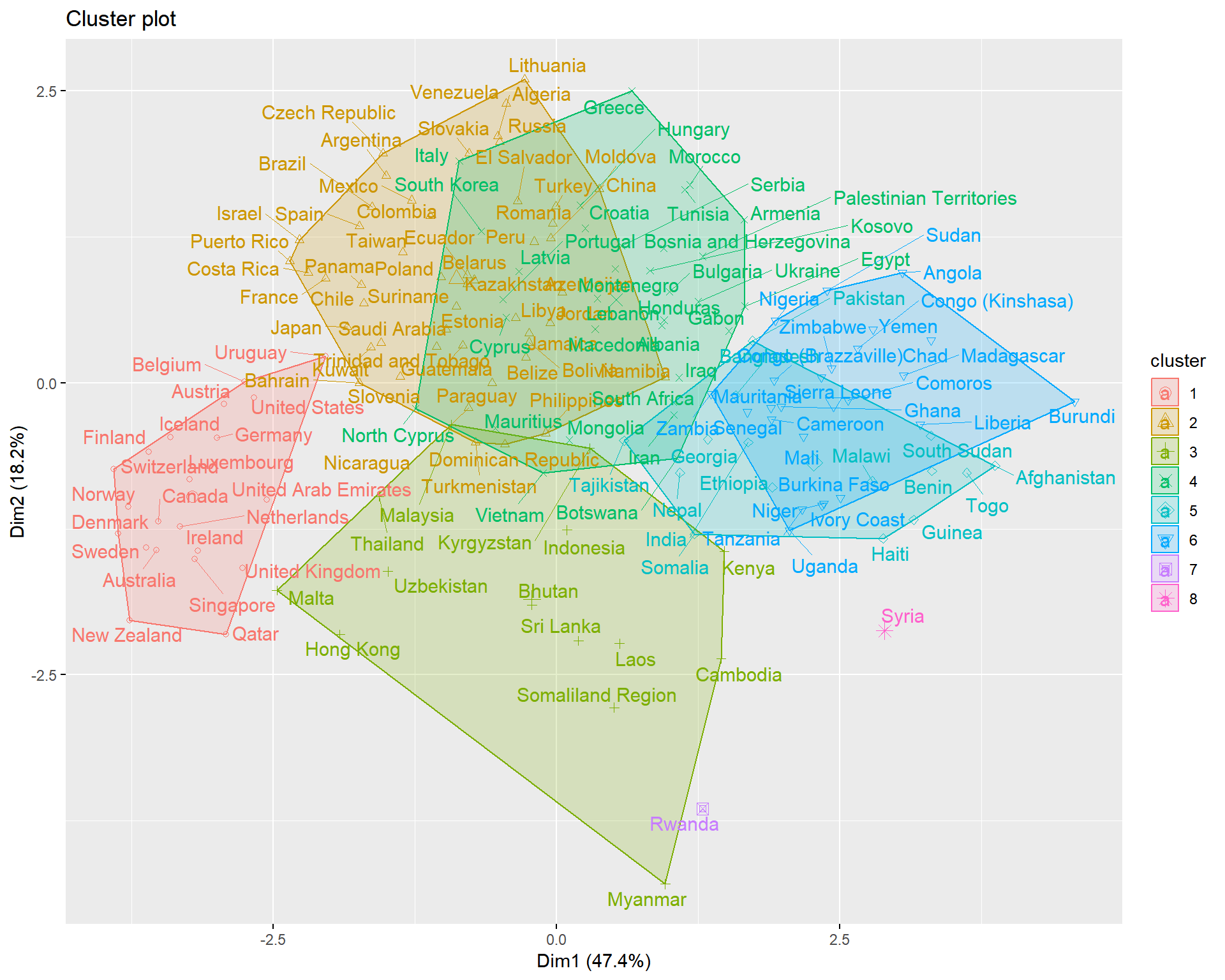
aplmelt <- melt(whrx.apl@clusters)
triplot(whrx.scale[aplmelt$value,], aplmelt$L1)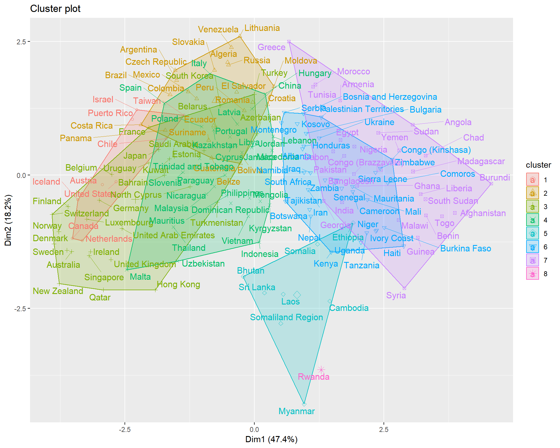
Gaussian Mixture
whrx.gm <- whrx.scale %>%
  GMM(gaussian_comps = 3) %$%
  predict_GMM(whrx.scale, CENTROIDS = centroids, COVARIANCE = covariance_matrices, WEIGHTS = weights)

whrx.gm$cluster_labels
## [1] 2 2 2 2 2 2 2 2 2 2 2 2 2 2 2 2 1 2 2 2 1 2 2 1 1 1 1 2 2 2 1 2 2 1 1
## [36] 2 1 1 1 1 1 2 1 1 1 1 1 1 1 1 1 1 2 1 1 1 1 1 1 1 1 1 1 1 1 1 1 1 1 1
## [71] 1 1 1 1 2 0 1 1 0 1 1 1 1 0 0 1 1 1 1 0 1 0 1 1 1 1 0 1 1 0 1 0 0 1 0
## [106] 0 0 0 1 0 0 0 0 0 0 0 0 0 0 0 0 0 0 0 0 0 0 0 1 0 0 0 0 0 0 0 0 0 0 0
## [141] 0 0 0 0 0 0 0 0 0 0 0 0 0 0 0 0 0triplot(whrx.scale, whrx.gm$cluster_labels)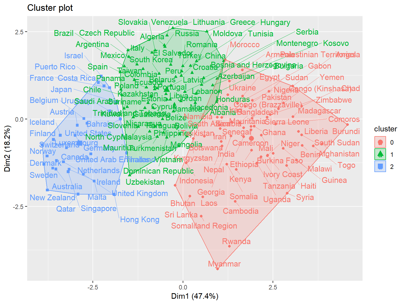
DBSCAN
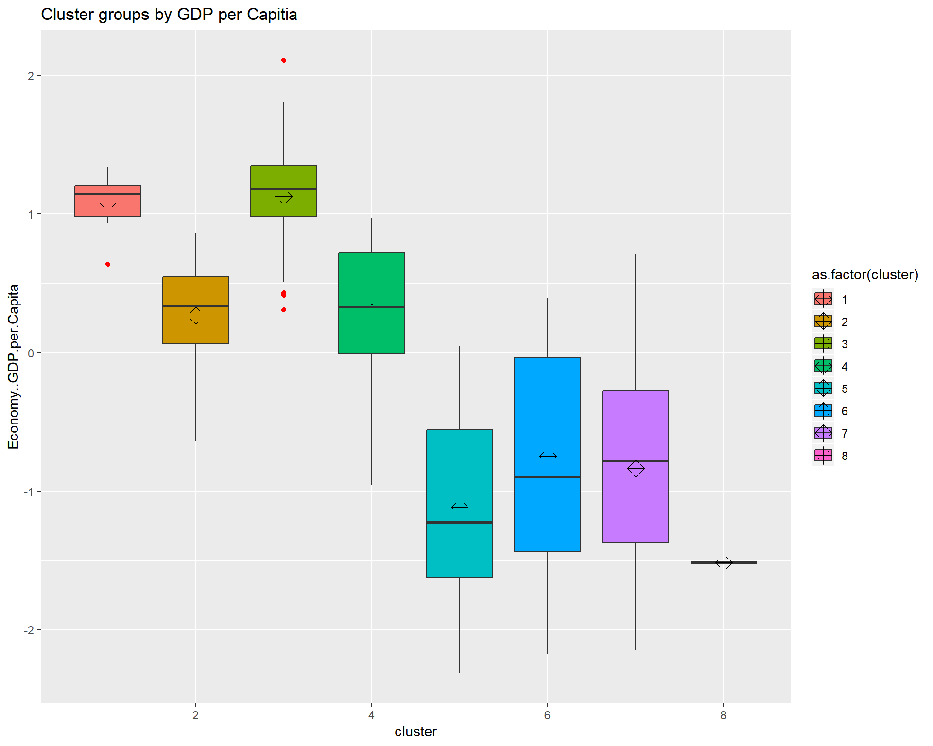
Density-Based Spatial Clustering of Applications with Noise. Finds core samples of high density and expands clusters from them.
whrx.dbs <- dbscan(whrx.scale, 1.2, minPts = 5)
unique(whrx.dbs$cluster)
## [1] 1 0 2 3triplot(whrx.scale, whrx.dbs$cluster)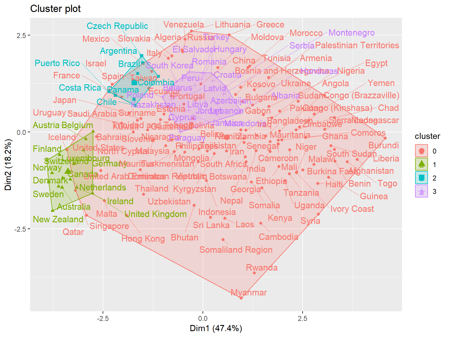
 ### HDBSCAN
Hierarchical Density-Based Spatial Clustering of Applications with Noise. It extends DBSCAN by converting it into a hierarchical clustering algorithm, and then using a technique to extract a flat clustering based in the stability of clusters.
whrx.hdb <- hdbscan(whrx.scale, 5)
unique(whrx.hdb$cluster)
## [1] 4 0 3 2 1triplot(whrx.scale, whrx.hdb$cluster)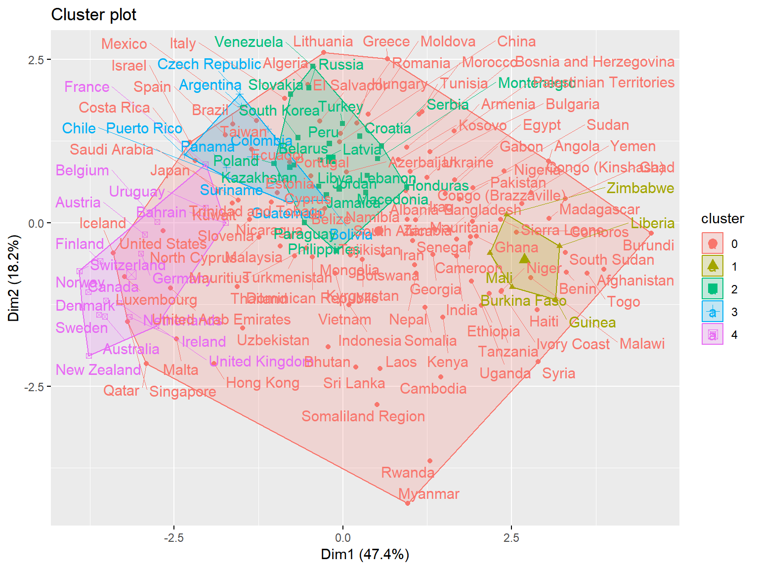
Conclusions
This notebook explored the World Happiness Dataset using a total of 6 models:
K-means, Agglomerative Clustering, Affinity Propagation, Gaussian Mixture, DBSCAN, and HDBSCAN.
The was a somewhat significant degree of variation between the examined models, but those that were not prescribed a certain number of clusters arrived at a 9 or 10 groups. With this many groupings, however, it became much more difficult to see exactly how a model was making clustering decisions.
For the models which we assigned a group count of 3, K-means, Agglomerative Clustering, and Gaussian Mixture, two diagonal or vertical lines could nearly be drawn between decision boundaries by way of GDP considerations.
Only one version of one model failed to perform at all, that was DBSCAN with scaled data, the rest found some form of suitable clustering. However, the Boxplots showed that when models were given free reign over the number of clusters, they tend to have one cluster serve to explain a large range of values and another to explain an extremely tightly grouped set with many outliers.
Future work
One thought that was left untested was looking to see if the previous model’s metrics in anyway influenced successive models. Since a new column was appended to the dataset and not removed, there is indeed a possibility of this happening. A good deal more EDA could be done on this dataset by looking at relationships between variables in a market basic analysis fashion. As always, there are many different hyperparamaters that could still be experimented with, as well as other clustering models like Spectral, Ward, and MeanShift that might yield interesting results. Additionally, and perhaps most poignantly, only Economy..GDP.per.Capita and Trust..Government.Corruption were explored, the rest were left untouched, thus leaving a significant portion of the data not truly explored to its fullest.