Plotting Distributions
Overview
This notebook will demonstrate the plotting of statistical functions with R.
For a normal distribution and Student’s T distribution (degrees of freedom = 4,8,12,30) the following will be plotted:
Probability Density Function (PDF) - A function of a continuous random variable, whose integral across an interval denotes the probability that the variable’s value lies within the same interval.
Cumulatve Distribution Function (CDF) - A function whose value is the probability that a corresponding continuous random variable has a value less than or equal to the function’s argumement
Quantile Function/Inverse Cumulative Distribution Function - A function that determines the value of the variable associated with a specific probability, such that the probability of the variable being less than or equal to that value equals the given probability.
Imports
library(ggplot2)
library(gridExtra)
library(tidyverse)
library(magrittr)
Data
The data used for this analysis is generated with R’s seq function, chosen on an symmetric interval from -e to e which, when used as a z-score, encompasses ~99.67% of a normal distribution
The variable naming convention used specifies x_norm, x_t as input values and follows a similar form to R for function output values i.e. the variable d_norm corresponds to R’s dnorm
mu = 0
sigma = 1
x_e<- seq(-exp(1), exp(1), length.out = 100)
quantiles <- seq(0.0033, 0.9967, length.out = 100) # Close for consistency

d_norm <- dnorm(x_e, mean = mu, sd = sigma) # PDF
p_norm <- pnorm(x_e, mean = mu, sd = sigma) # CDF
q_norm <- qnorm(quantiles, mean = mu, sd = sigma) # iCDF

df.pdf <- data.frame(x = x_e, y = d_norm)
df.cdf <- data.frame(x = x_e, y = p_norm)
df.icdf <- data.frame(x = quantiles, y = q_norm)
Exploratory Data Analysis
We will be using an artificially generated dataset for the purpose of this demonstration, as such, no preprocessing is required.
Normal distribution
# normal_pdf
p1 <- df.pdf %>%
  ggplot(aes(x, y)) +
  geom_line(stat = "identity", col = "red", size=2) +
  scale_y_continuous(expand = c(0.01, 0)) +
  labs(title = "Normal Probability Density", x="x (in SDs)", y="Probability Density") +
  theme_bw(16, "serif") +
  theme(plot.title = element_text(size = rel(1.2), vjust = 1.5))

# normal_cdf
p2 <- df.cdf %>%
  ggplot(aes(x, y)) +
  geom_line(stat = "identity", col = "blue", size=2) +
  scale_y_continuous(expand = c(0.01, 0)) +
  labs(title = "Normal Cumulative Density", x="x (in SDs)",y="Probability") +
  theme_bw(16, "serif") +
  theme(plot.title = element_text(size = rel(1.2), vjust = 1.5))

# normal_icdf
p3 <- df.icdf %>%
  ggplot(aes(x, y)) +
  geom_line(stat = "identity", col = "green", size=2) +
  scale_y_continuous(expand = c(0.01, 0)) +
  labs(title = "Normal Inverse CDF", x="Probability",y="Quantile") +
  theme_bw(16, "serif") +
  theme(plot.title = element_text(size = rel(1.2), vjust = 1.5))

grid.arrange(grobs=list(p1, p2, p3), layout_matrix = rbind(c(1, 2),c(3, 3)))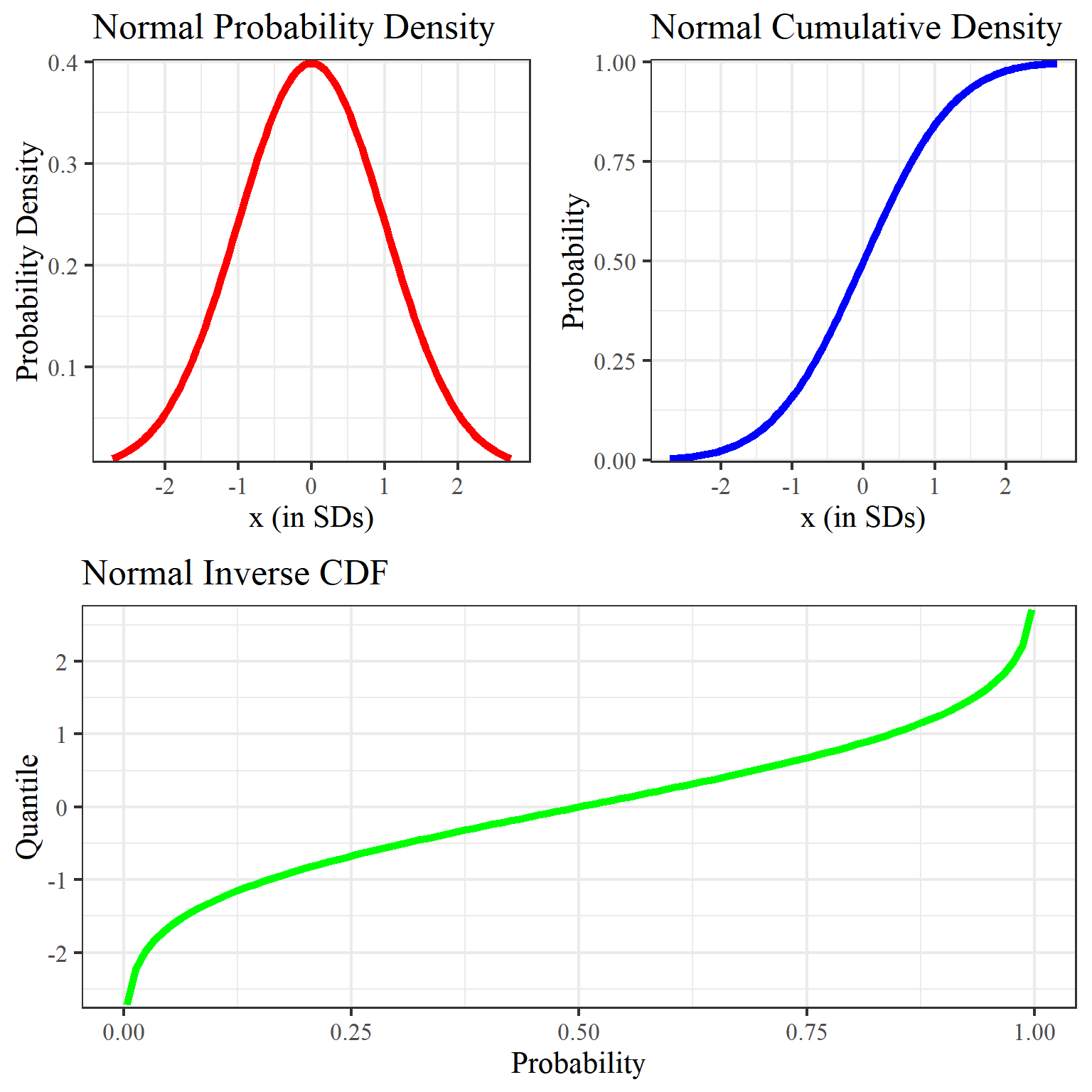
Student’s T Distribution
cset = c("black","orange","green","blue","red")
#cset = c("red","blue","green","orange","black")
df.stdt <- data.frame(norm=d_norm, t(mapply(dt, x_e, MoreArgs = list(c(4,8,12,30))))) %>%
set_colnames( c("norm","dgf.4","dgf.8","dgf.12","dgf.30"))
df.stdt %>% as_tibble() %>% gather(key="degrees",value = "value", factor_key = TRUE) %>%
ggplot(aes(x=rep.int(x_e, length(cset)), y=value)) +
geom_line(aes(color = degrees, linetype=degrees), stat = "identity", size=1.1 ) +
scale_y_continuous(expand = c(0.01, 0)) +
labs(title = "Student's T: Probability Density", x="x (in SDs)", y="Probability Density") +
theme_bw(16, "serif") + theme(plot.title = element_text(size = rel(1.2), vjust = 1.5)) +
scale_colour_manual(values=cset)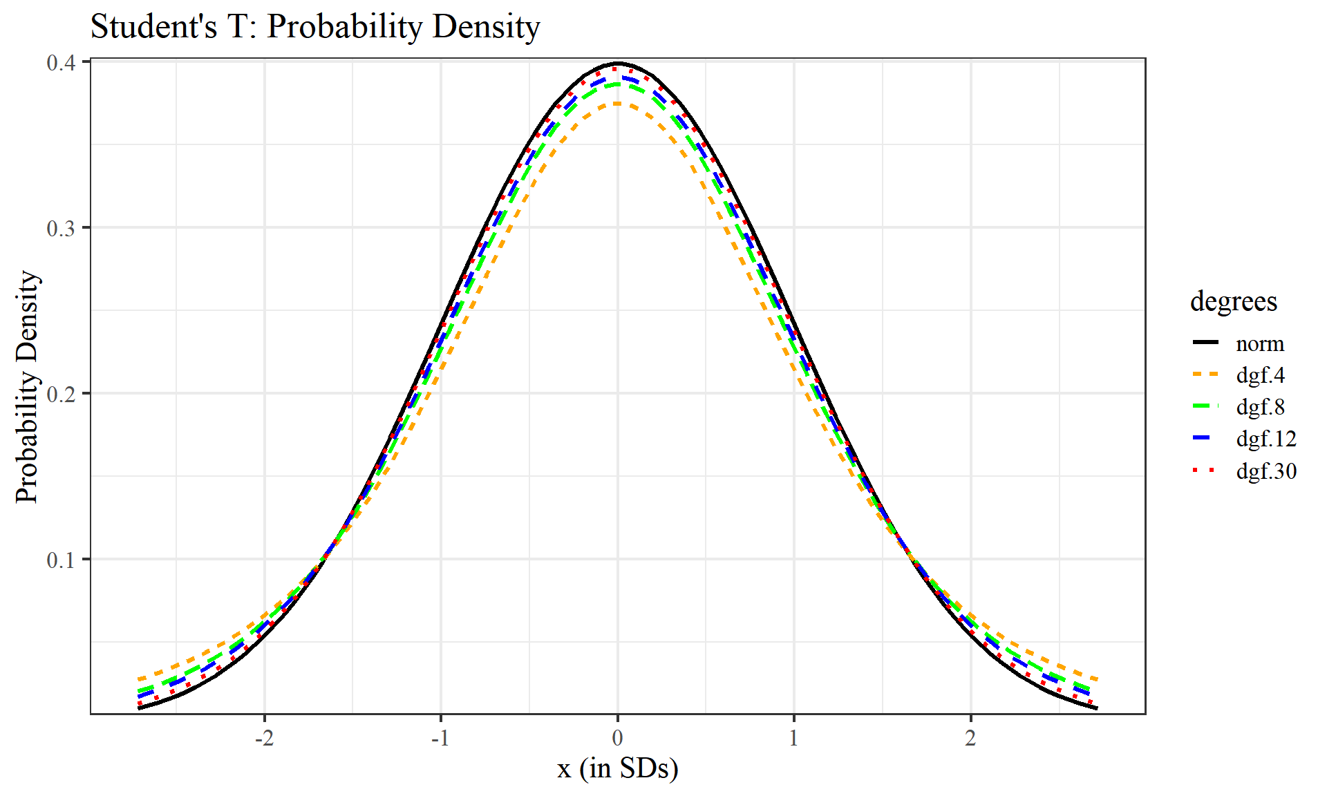
#Student's T: Cumulative Distribution
df.pt <- data.frame(p_norm, t(mapply(pt, x_e, MoreArgs = list(c(4,8,12,30), lower.tail = TRUE)))) %>%
  set_colnames( c("norm","dgf.4","dgf.8","dgf.12","dgf.30"))

df.pt %>% as_tibble() %>% gather(key="degrees",value = "value", factor_key = TRUE) %>%
  ggplot(aes(x=rep.int(x_e, length(cset)), y=value)) +
  geom_line(aes(y=value, color = degrees, linetype=degrees), stat = "identity", size=1.1 ) +
  scale_y_continuous(expand = c(0.01, 0)) +
  labs(title = "Student's T: Cumulative Distribution", x="x (in SDs)", y="Probability") +
  theme_bw(16, "serif") + theme(plot.title = element_text(size = rel(1.2), vjust = 1.5)) +
  scale_colour_manual(values=cset)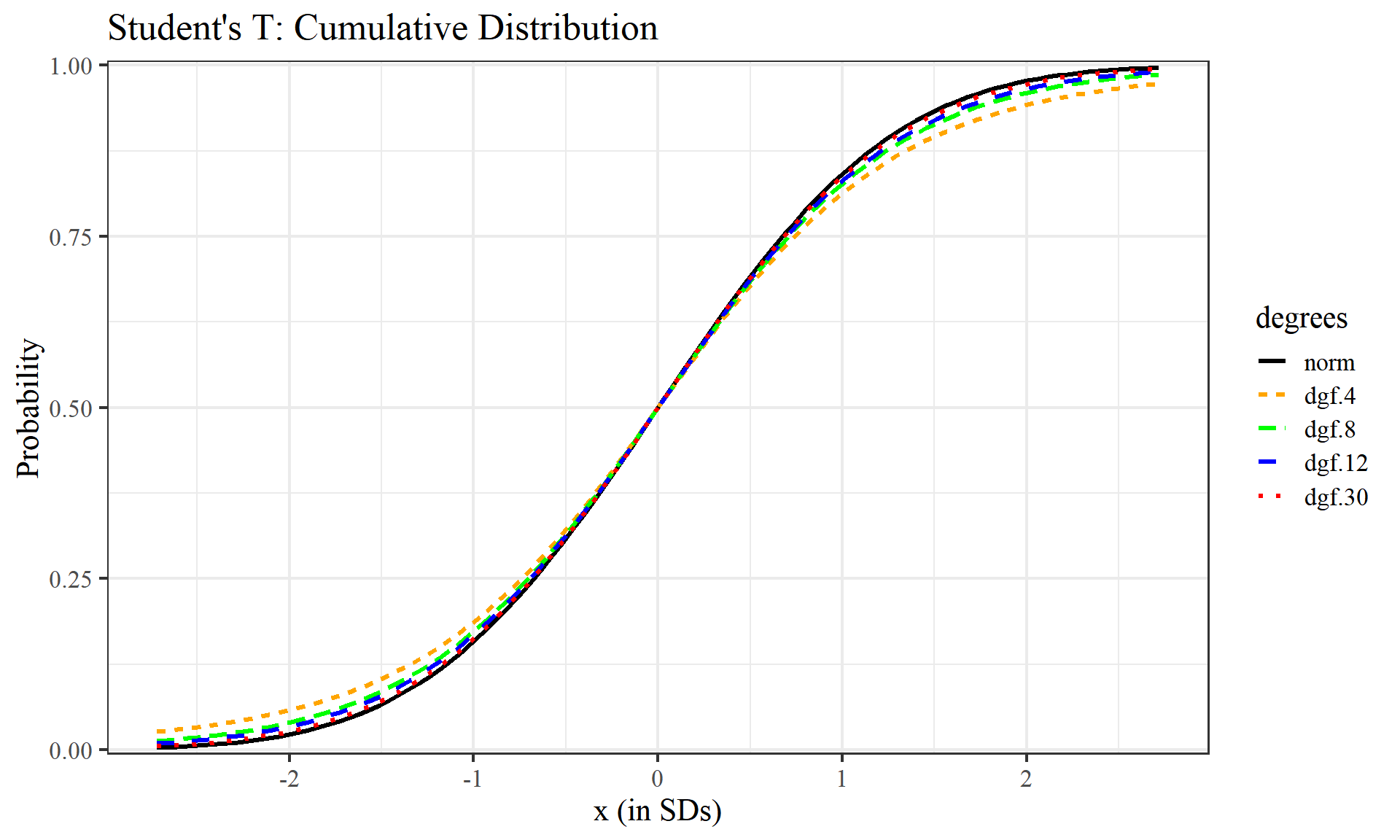
# Student's T: Inverse CDF
quantiles <- seq(0.0033, 0.9967, length.out = 100)
df.qt <- data.frame(q_norm, t(mapply(qt, quantiles, MoreArgs = list(c(4,8,12,30))))) %>%
  set_colnames( c("norm","dgf.4","dgf.8","dgf.12","dgf.30"))

df.qt %>% as_tibble() %>% gather(key="degrees",value = "value", factor_key = TRUE) %>%
  ggplot(aes(x=rep.int(quantiles, length(cset)), y=value)) +
  geom_line(aes(y=value, color = degrees, linetype=degrees), stat = "identity", size=1.1 ) +
  scale_y_continuous(expand = c(0.01, 0)) +
  labs(title = "Student's T: Inverse CDF", x="Probability", y="Quantile") +
  theme_bw(16, "serif") + theme(plot.title = element_text(size = rel(1.2), vjust = 1.5)) +
  scale_colour_manual(values=cset)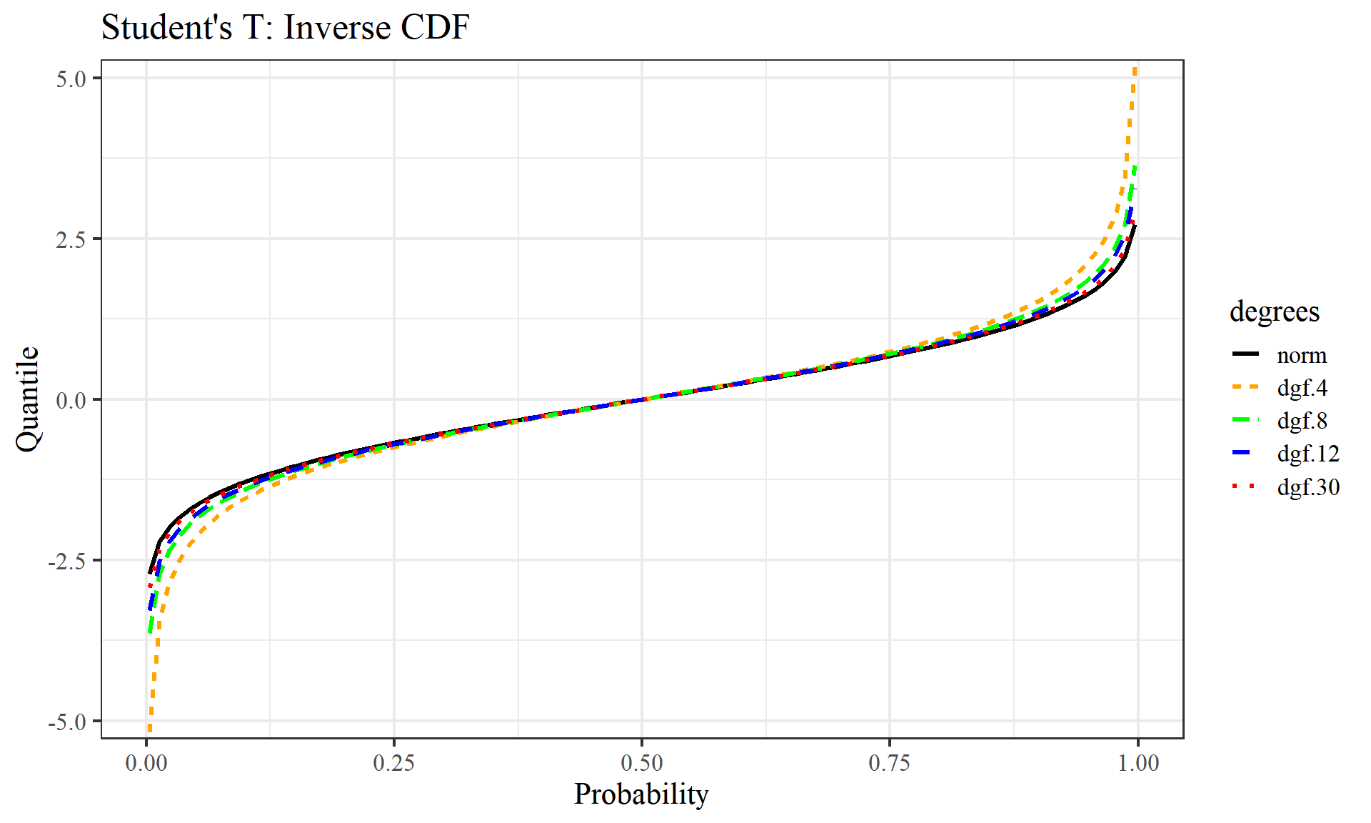
We can see as we raise the degrees of freedom, each graph increasingly begins to look like the normal distribution graphs above. Degrees of freedom can be thought of as the minimum number of independent coordinates that can determine the position of entire system.
Conclusions
This notebook demonstrates the calculation and plotting of three fundamental statistical functions:
- Probability Density Function
- Cumulative Distribution Function
- Quantile Function/Inverse Cumulative Distribution Function
for a normal distribution and Student’s T distributions with varying degrees of freedom
Future work
Other works could involve using an actual dataset rather than a contrived one to look for interesting real-world insights, exploring additional distributions such as Weibull, Gamma, Beta, or Chi-Square, and applying other statistical functions like the survival and momentum generating functions.
References:
Definitions:
- https://en.oxforddictionaries.com/definition/probability_density_function
- https://en.oxforddictionaries.com/definition/us/cumulative_distribution_function
- https://en.wikipedia.org/wiki/Quantile_function
- https://support.minitab.com/en-us/minitab-express/1/help-and-how-to/basic-statistics/probability-distributions/supporting-topics/basics/using-the-inverse-cumulative-distribution-function-icdf/
Docs and Code Snippets:
- http://seankross.com/notes/dpqr/
- https://stat.ethz.ch/R-manual/R-devel/library/stats/html/TDist.html
- https://stackoverflow.com/questions/7162936/putting-a-repeating-value-into-a-column
Other Resources: